Home » Guides » Subtitling Guide
Subtitling Guide
tl;dr How to make my subs look better?
- Your font size is probably too small
- Your font is probably not bold enough
- Your border is probably not thick enough
- Your margin is probably too small
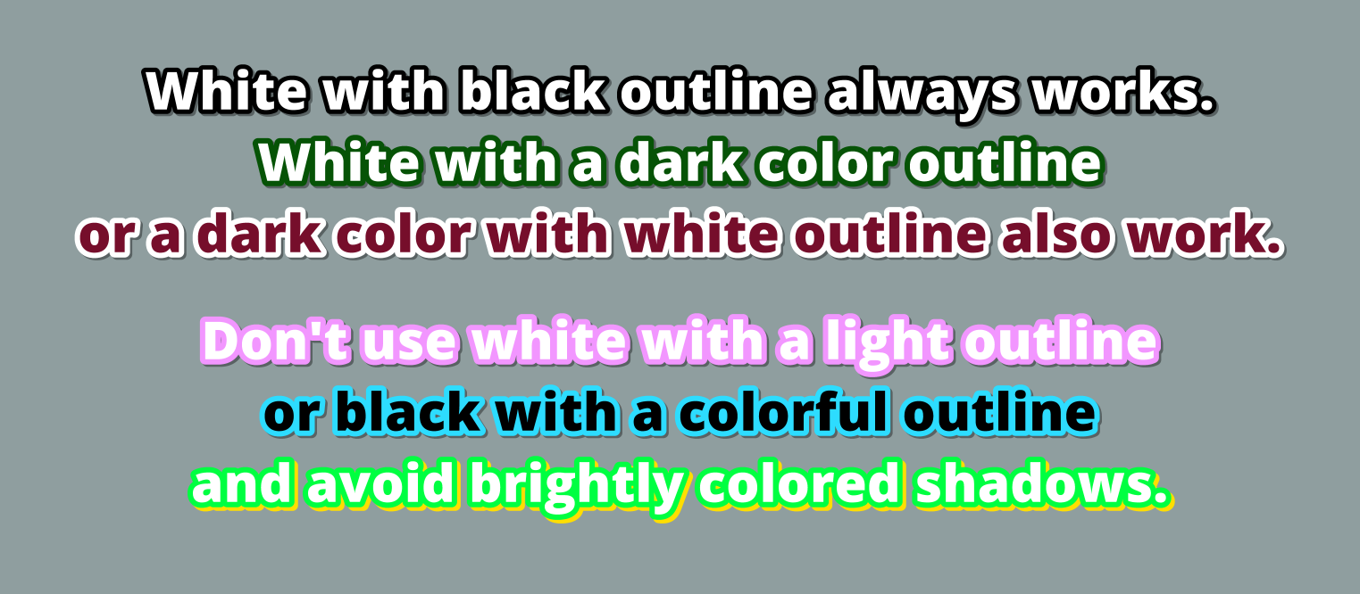
- There’s probably not enough contrast between your body color and border color
- Don’t use serif fonts
Fonts
For your main subtitle font, you should use a clean, sans-serif font that’s nice and bold, in order to make your subtitles easy to read. Remember, your viewers will be looking at this font for the entire video.
Don’t know where to start looking for your main font? Try Google fonts. That link will show you a listing of free, thick, sans-serif fonts from Google’s collection, most of which are good for subtitles. You can adjust the thickness slider up or down a step to see more decent options.
If you are adding a translation for on-screen text, then feel free to pick a font that is similar to the original font, as long as it’s also readable. You can find various free fonts on sites like DaFont, just try not to go too crazy.
Font Size
If you plan to upload to Twitter or YouTube, many people will be watching on mobile, which makes it all the more important to have a big, bold font for your subtitles.
As a rule of thumb, I would use font size 64 or larger for 720p video and 100 or larger for 1080p video.
Positioning and Margins
Where you place your subtitles matters more than you may think. Take a look at the example below:
See how much of a difference the background makes?
You should avoid placing your subtitles on busy parts of the video. For example, if you’re working on a gaming stream, avoid overlapping in-game menus or HUDs. Also, you should never overlap text on screen if you can help it. This includes things like stream tickers.
Margins should also be relatively large. When watching a video, your eyes are mostly focused on the center of the screen. So you want your subtitles close to the center of the screen, but not so close that they get in the way. As a rule of thumb, your vertical margin should be at least as large as your font size, and your horizontal margins about twice as large as that.
Colors
The above image summarizes most of what you should know. When in doubt, use white with a black outline. You cannot go wrong with white with a black outline. In addition, I recommend you only use pure black for your shadow and set it to 50% transparent. That way, the shadow will not be too strong, but it will look dark on any background.


